=============== ORIGINAL POST ===============
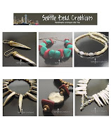
I'm ready to give my online Etsy jewelry store a facelift for holiday shoppers. In mid-October I'll add a New Look & begin posting dozens of new creations & great new pics. HOWEVER, I can't decide between The Look with Colors & The Look with White. Both Looks include a new banner across the top. MY GOAL: The New Look must be so inviting & attractive that folks will want to click to enlarge the jewelry.


YOUR OPINION MATTERS TO ME. Please complete the POLL on the right about the 2 mockups below. SUGGESTION: Just click to enlarge the mockups to compare side-by-side.
I'm so grateful for your time. To leave suggestions or feedback, please click "Comments" below. THANKYOUTHANKYOUTHANKYOU:)
Cheryl Z's online stores: Seattle Chic and Classic Beadwear

5 comments:
I voted for the white, and yes I AM between 40-60. To me it was hard to pick because the colors in both are so washed out. Hopefully that is for the choice thingy only. Also the jewelry itself was different as well as the backgrounds, so I wasn't able to feel I was only choosing the different background color. All in all, both would look good with brighter colors and less gray to your whites.
Well, You asked for my opinion... so please only take what you want from it and leave the rest. Photography aside I really like your jewelry designs! Good luck with the new shop design.. Ginny from CiszekDesigns, my jewelry on etsy....
Hi Ginny... I wonder if you're viewing the 2 mockups on a Mac? I know a Mac reallly washes colors that look bright on a PC. I DO appreciate your comments. If I use white, I'll need to add more reflectors to get whiter whites. Thanks for the heads-up on that:) Cherylz
Cherylz- I have a PC.. The colors on my monitor look like they have a white translucent film all over them.
Do you have a photo editing program like Photoshop or something? Picasa also has ability to adjust the contrast, brightness, color balance, intensity and stuff like that. Do you edit ad adjust your pictures after taking them? Because for me I use Photoshop and I can change the tones of my whites, color intensity, ect after I take the pictures. Just wondering... The black works really well on some items and not so well on others, white seems to work best if you want one overall look for all your pieces. again just my opinion.. Ginny
I voted for the colors. I did like the black one most of all but then I realized that you can't put just any item in there and make it look good with black. Where with the colors, you can choose a background that will make the jewelry "pop".
Good luck.
Linda
OMG! A friend just advised that in my White mockup "boxes overlapped" & a chunk appears to be missing from the copper diamond-shaped earrings! The earrings are perfect... no chunks missing. It was the white crystal atop the Space Needle in my watermark that overlapped the earring rim. I have now moved the watermark off the jewelry. WHAT'S FRUSTRATING in creating the mockups, which are just fake Etsy homepage reproductions, is that they look perfect on MY screen. No overlapping boxes. All white backgrounds the same crisp white. But just in case, I've now relocated the white pics of the mockup so I'm certain they no longer overlap. FAVOR: Please advise if any mockup looks mechanically flawed. I don't want my simulation effort to skew the vote. Thanks so much!
Post a Comment