Two days before The Fall Thing at Phinney Ridge Community Center, I braved the terrible traffic from Bellevue into downtown Seattle to reach a large, high-end dept. store, offering the mystery props for $35 each (originally $1000!) It didn't take me long to select perhaps the only item left that could actually sit on my table & wouldn't take much room to store. Exactly what I wanted -- in fact, PERFECT!
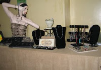
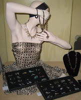
Let me introduce Monique, formerly known as Mira. Monique was special because her arms & hands were both above her waist, allowing me to remove her bottom half, a huge advantage over other mannequins whose arms below the waist required them to stand, possible only after building a brace. Furthermore, I could store Monique's extra body parts in the attic. And look at the pose of her hands. Perfect for displaying jewelry! Even her makeup was perfect. (Did you know that if you first apply concealer, you can add human makeup to Monique?) And Monique looked great in tiger fabric from my first fair! (I'm trying hard not to think this discussion is creepy...)
As I played with my craft show table arrangement the night before, I had another brainstorm. I store my jewelry in the black velveteen trays from my new product case described in the Aug. 28 blog post. Those trays would display the jewelry beautifully if tilted up on blocks!
Oh, I was so very proud of myself! I was definitely on a brainstorming roll.

 That's when I should have quit & gone to bed. Instead I stayed up all night typing pages & pages of text into a grid, where each cell in the grid contained the description & price of one item for sale. Because I didn't have time to cut the grid into cards & place them near the item described as I'd planned, I couldn't quickly answer the simplest customer questions, like "How much is this?" At least 5 very enthusiastic customers came by to look closely at my jewelry & ask a few questions, but scanning pages of grid cells under pressure isn't easy -- especially after no sleep. So many lessons to learn; so little time!
Despite my own major misstep, I really enjoyed this show. My table was 2nd just inside the entry door, so folks definitely got to pass my booth this time. And Monique drew many of them over for a closer look. I hope the new layout is more sophisticated & effective than the Fremont fair table. What do you think?

The feedback from shoppers was extremely positive. I sold Steely Blue despite wasting this wonderful woman's time to search for the price & description. In fact, she came back 3 times to bring 3 more people to see the jewelry during my frustrating search for the price! Even shoppers that didn't wait for my fumbling searches asked to be put on my mailing list.
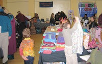
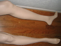
 Another big plus about this show was the opportunity to meet more EtsyRain sellers. Participating in the online forum together for months now, I feel I know them since our brief face-to-face at the craft show. I left the fair exhauted, but smiling inside about the new friendships, the enthusiam of potential buyers, and my satisfaction with the 'look' of my table. But the top 2 items on my To-Do list are ==> match up the description cards with the items AND remove Monique's lower half from the hallway floor. Or at least turn on the light so the unexpected sight isn't so scary!

2 comments:
Monique rocks!!! Great idea, great possibilities!
NorthernGirl
I agree about Monique being fantastic. About the prices, when I shop at craft fairs, I am shy to ask prices as I feel that doing so puts me on the spot to respond which can be awkward if the price is too high. So I think you might make more sales if the prices were easily visible.
Dorothy
Post a Comment